Brand Identity
Trinity Finance and Accounting
From Accounting Firm to
Full-Service Finance Brand
Trinity Accounting Consultants had built a strong reputation over years of client work. When they decided to expand into mortgage broking and lending, they needed a brand that could carry both services without splitting their identity in two.
The original ask was a separate brand for a new lending entity called Trinity Lending.
As conversations developed, it became clear that running two identities for connected services would fragment what they'd already built. We recommended a different path: one unified name, one visual system, one brand promise. That's how Trinity Finance and Accounting was born.
One constraint shaped everything: the client wanted to keep the winged lion mark. It carried recognition and meaning. Our job was to evolve it, not replace it.
-
The brief had four tensions to resolve: continuity vs. freshness, two services under one voice, authority without coldness, and a legacy logo that couldn't be replaced.
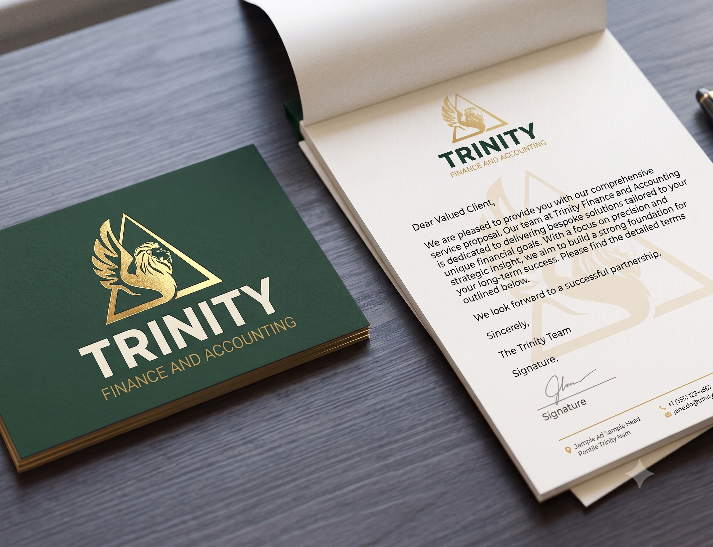
We kept the lion in the triangle. Changed the font to a clean, commanding wordmark. Shifted the palette to deep forest green and amber gold, which tied the existing brand equity to a more refined system that could stretch across business cards, social posts, and merchandise without breaking.
Typography pairs Garet for display with Open Sauce for body copy. Together they land where the brand needs to: expert but not stiff, warm but not casual.
-
Strategic rename from Trinity Lending to Trinity Finance and Accounting
Refined logo system with updated colour and typography (the lion mark was retained and refined, not replaced)
Six-colour brand palette anchored in forest green and amber gold
Full brand guidelines document covering colour, typography, voice and tone, logo usage, and do's and don'ts
Business card and letterhead design
Branded merchandise mockups (water bottle, tote bag)
Three social media post templates: editorial, dark, and light
-
Trinity launched with a complete brand identity that existing clients would recognise and new lending clients would trust. The unified name removed the ambiguity of running two separate businesses. The guidelines document means their team can execute consistently across every channel from day one.